
 This week’s Before and After is brought to you by Why S @ The House on Red Hill. Why S recently completed a major kitchen and dinning room renovation that started about two years ago.
For this winning submission, Why S gets a $25 gift card to Lowes, Home Depot, or Amazon. And, we’ll make a $35 donation to Habitat for Humanity in her honor. She is also a part of our end-of-Summer contest for a $150 gift card.
Check out this great Before and After and this weeks Habitat Quick Fact.
Kitchen & Dinning Room Renovation by Why S
When we moved in, there were only a few open shelves that I could use. I had to buy a Target cabinet to complement it. I deemed the large, ungainly drawers too disgusting for proper kitchen items. There was little counter space. There were ugly mismatched white tiles behind the stove and the refrigerator jutted into the door to the hallway. The doors under the counter soon fell off their tracks. Poorly cut peel and stick vinyl tile covered the floors and it’s embossed design made it nearly impossible to clean. Cobwebs clung to the grease coated walls around the old range hood.
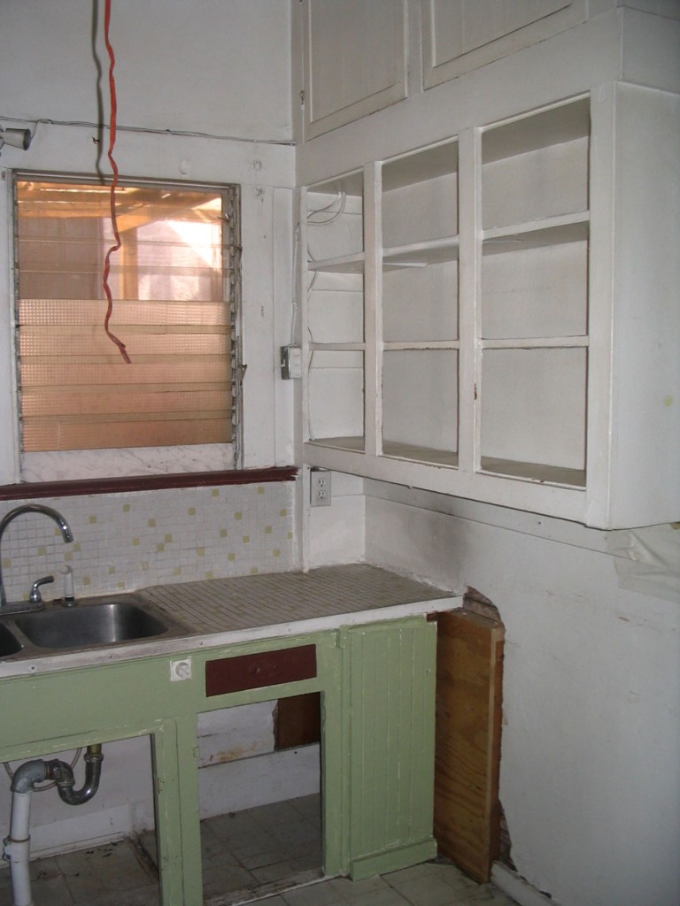
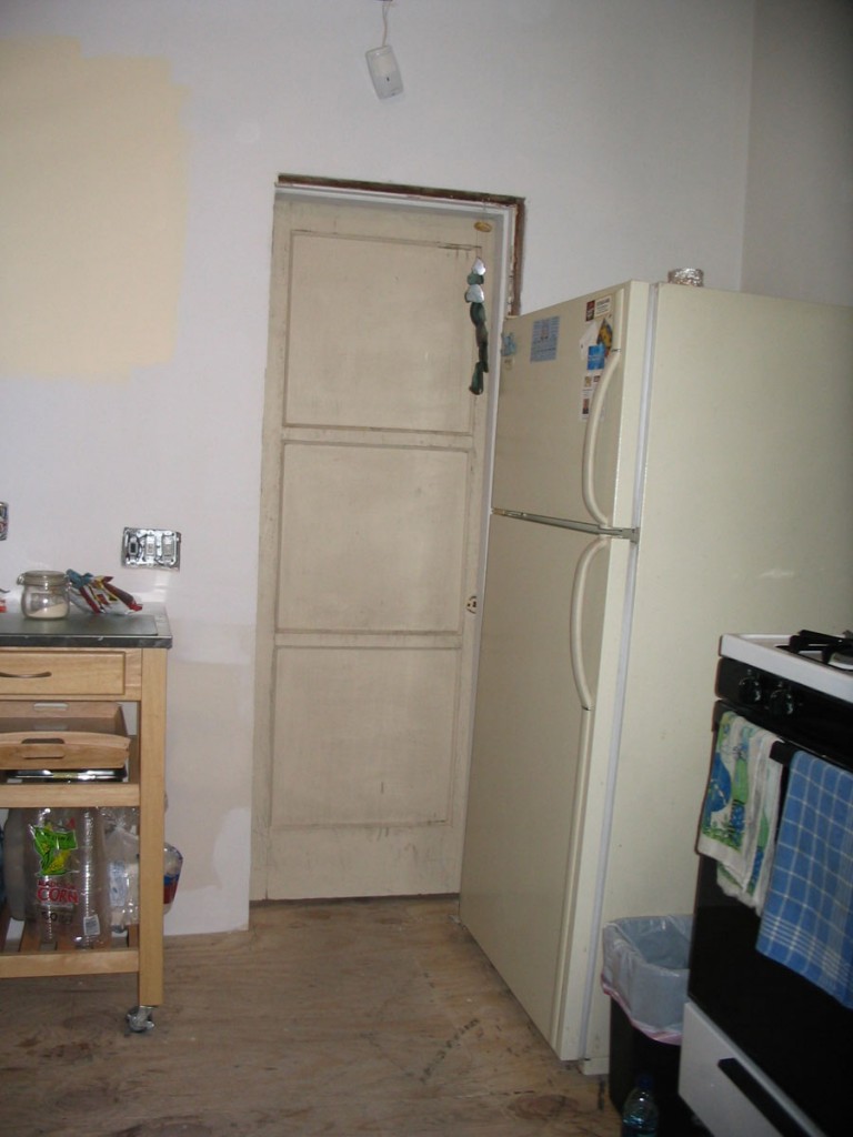
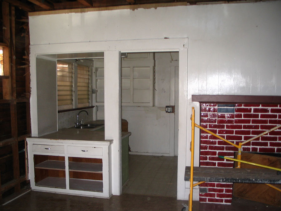
But we made the best of it for five years while we remodeled the two bedrooms and two bathrooms. We didn’t want our first learning experiences and first mistakes to be in the kitchen.
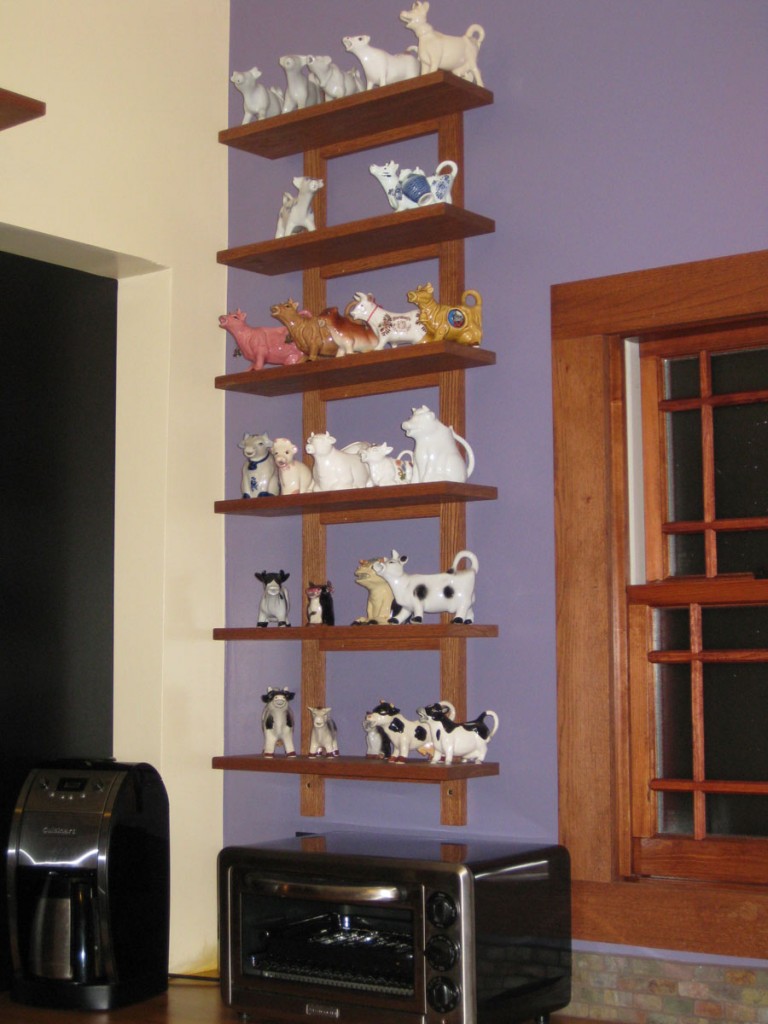
The first consideration was my collection of cow creamers. Even though space is limited in the 94 sq ft kitchen, I knew we’d have to lose at least one potential wall cabinet for a shelf for the cows. The other problem was where to put the fridge. We devised a number of configurations, none of which were functional. A refrigerator simply would not fit in the kitchen. At least, it would not fit in the kitchen with a dishwasher. If it weren’t for the addition of the dishwasher, we might have been able to make it work, but not adding a dishwasher was not an option I could accept.
So the fridge straddles the line with the dining room. I really wanted to avoid that but without adding floor space, which we don’t have the option of doing, there was no choice. So that’s one reason we chose black cabinets. With the black refrigerator blending in with the cabinets, we figure the fridge appears a lot less “fridgy” standing in the dining room. I found a black model with an interior water dispenser. We added some art magnets to help make it less fridgy. With the dividing wall removed, the effect is now less kitchen/dining room and more like one big farm kitchen, so the location of the refrigerator is ok.
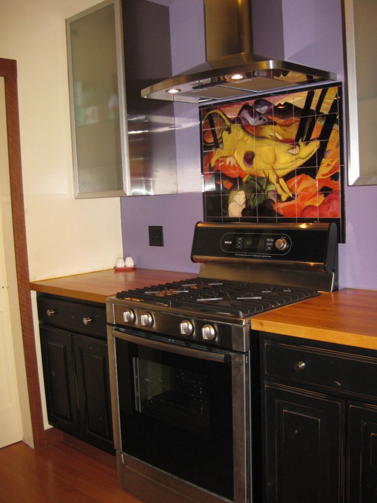
Even though we don’t have quite as much reachable storage as I would like, it’s still more than I’ve ever had before. The butcher block counter tops were from Ikea. We really saved money with that choice because my husband was able to cut and install them himself, which he would not have been able to do with a stone product. They do require more care if you want to avoid stains and watermarks but with a 100 year old house, I like their timeless quality.
We chose to use the same small slate tile on the counter backsplash as the tile on the dining room fireplace. The paint colors were selected from the tile mural behind the stove. We used metal wall cabinets from Ikea to lighten up the small space where the range stands. Having the black cabinets there would have looked too heavy.
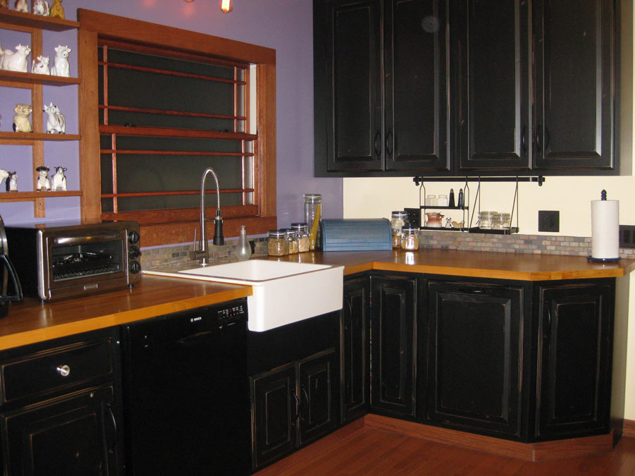
The farm sink is also from Ikea. But I would caution anyone who is under 5’5″ (as I am) to consider a farm sink that mounts under the counter and flush with the counter fronts. This one mounts above and the extra height, plus the sink’s unusual depth (it sticks beyond the counter’s front) makes it an exceptionally bad choice for us petites. I would never have considered that just from seeing it in the store. On the other hand, all the other farm sinks I saw were around $1,000 and the Ikea sink was under $200, so there you go. But, not having a farm sink was not an option for me aesthetically.
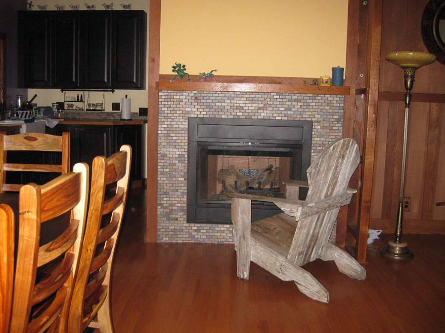
The wainscoting in the dining room is made from oak panels with oak battens my husband cut and stained. The fireplace mantle is made from the original redwood that was taken from walls that were removed. We were lucky to find a huge dining table that perfectly matches the kitchen cabinets in color and distressed detailing. It was on sale and deeply discounted, so even though the room wasn’t ready for it for 9 months, we bought it and stored it covered up in the driveway because it was too good to pass up. The wooden chairs were on sale too. Those were stored at my husband’s work place for months. I think their rustic quality goes well with the cows and plow yoke above the fireplace. The plow yoke is a relic rescued from my uncle’s farm in Mexico.
While we regretted that it was necessary to gut the original kitchen (and lost the one remaining built-in) we love the openness and space. The new layout is tons more functional for entertaining and for everyday living. Which is good, ’cause after 7 years of remodeling, we’re ready to start living.
Thanks from One Project Closer!
This is a great Before and After and we are so pleased that you shared it with us. The kitchen and dining room look great. Beautiful work, Why S!
Habitat Quick Fact
Can’t decide on a gift for someone? Consider the Habitat Gift Catalog. From Habitat’s site:
The Habitat Gift Catalog is an online gift catalog that allows you to support the meaningful work of Habitat for Humanity by giving a donation to HFH in someone else’s name—a friend or family member.
You browse the online catalog and choose a gift in someone else’s name. A card gets sent to them, telling them that a gift has been made to Habitat for Humanity in their honor, and somewhere, a family in need of a home benefits through the gift you provided. You can buy a box of nails, a kitchen sink, living room or an entire house—all in honor of someone you care for.
How to Enter our Before and After Contest
Just send us an e-mail in any format to beforeandafter@oneprojectcloser.com. Hurry, our Before and After summer series is almost over!


Very nice!! That’s truly an amazing transformation! Nothing changes a home like a new kitchen.
I’ve been following during the latter half of this amazing renovation. Nothing short of fantastic! Congrats!
Holy Creamer Cow! Thanks OPC! I was just doing a little late night catching up and wow . . .
And thanks not just for selecting my project but also for having the contest. It’s great fun and inspiration for all of us to see the other Before & Afters collected together and a good reminder that HFH is a great and worthy cause.
I love what you have done, I am in the process of doing the same thing in my home.
Question how did you get the cabinets like that?? Did you stain them ?