
This’ll be the 7th winner of this year’s Before & After series, and I’m really impressed with the amazing transformations we’ve seen so far. I truly appreciate everyone who has taken the time to share their story with us. If you’d like to learn more about the series or find out how to participate, check out the link above.

Without further ado, it’s time to announce this week’s winner. Today we’re featuring a tremendous dining room remodel by Michael from Better D.I.Y. and it’s plain to see how much hard work he put into this project.
As this week’s winner, Michael will receive a $50 gift card, and we make a $100 donation to Habitat for Humanity in Michael’s honor.
The Formal Dining Room
So…my wife and I were lucky enough to sell our small 1950s cape. We also bought a 1992 colonial house. We closed on the old house and the new the same day (May 27th). This house that is new to us has some major outdated interior things. Wallpaper in every room, tan/almond everywhere (carpets, outlets, paint, baseboards, etc…).
We needed to buy a new house for our ever expanding family. We welcomed my 3rd child on April 1st. It took over a year to sell our house in this market, but we were lucky enough to get it sold!!
The first room we have updated is our formal Dining Room. About 3 weeks ago, I saw 170 sq. ft of 3/4″ x 4″ Maple Hardwood on Craiglist. I picked it up for about $3/sq. ft which is a great deal. They sell the same stuff at Lumber Liquidators for about $5/ sq. ft. The room is about 160 sq. ft., so I knew it would be tight and not much room for error, but I could always buy another box if needed as it is still available.
Before Pictures:
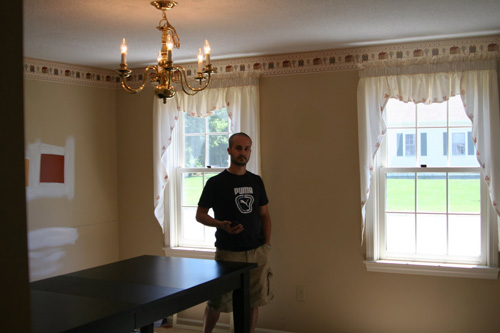
Lovely window treatments, wallpaper border and light.
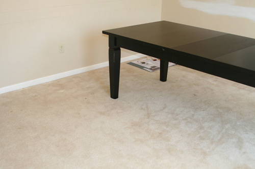
Beautiful carpet and a genius idea to have in your formal dining room.
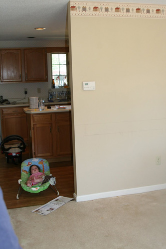
Here is the newest addition “supervising”.
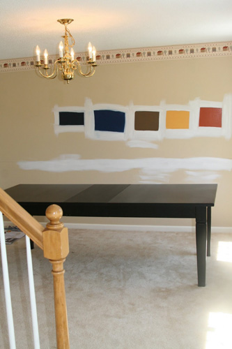
These were our color choices. We bought 5 samples and went from there.
During Pictures:
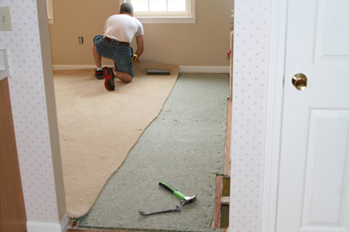
After removing wallpaper, I removed the carpet and then the baseboard. If you cut the carpet and pad into strips, the city will take it with our weekly trash pickup service. This is convenient and a great service!!
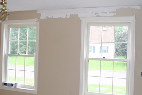
While removing the wallpaper, some of the paint came with it which made the surface uneven. I had to mud these areas out and sand them.
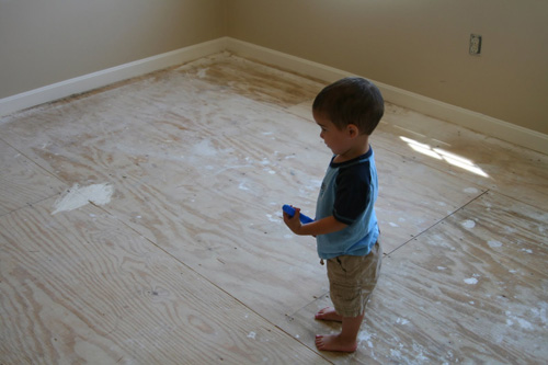
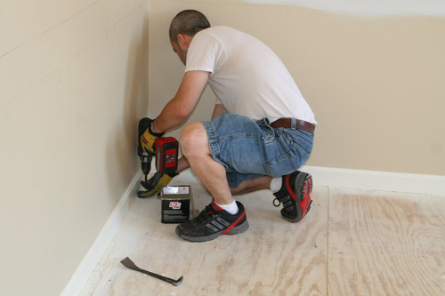
There is daddy’s little helper always under foot. I screwed down the sub floor so that we would never develop any squeaks. Nothing worse than a squeaky floor.
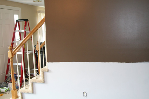
After painting:
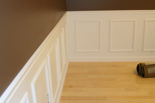
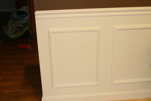
I have always wanted my formal dining room to look upscale, so going into this project, I knew that I wanted a chair rail and wainscoting using the wall frames. The nice thing is that Lowe’s sells pre-made wall frames. This saves me the time of creating a jig, cutting the frames, gluing them together and what not. Of course, it made it difficult to modify any of them like the one around the stairs.
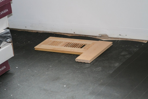
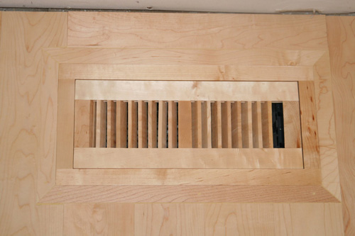
Flushmount vent:
The flushmount has a groove around the entire frame that the vent sits in. I like this one better than the big box ones because it still has the louver to open and close the vent as needed.
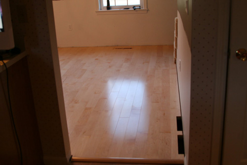
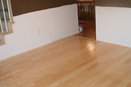
Post Flooring Installation:
I ran into some difficulty when I installed the flush mount registers. The register was about 1″ from the edge of the closest floor board. Since I wanted to use the groove of the register to hold it down, I decided to build a frame around it. I mitered the corners of my frame. I am very happy with the results.
I purchased the Skil Flooring Saw when we bought this house because I knew I would be replacing a lot of carpet in the future. This saw is amazing. The dust bag/collection is the worst part. It kicked up a lot of dust into the room, but the convenience of having the saw in the same room was priceless and worth the extra mess. It has the nice large no mar feet and is very light and easy to move around. I would recommend it as it is worth the money if you plan on doing a lot of flooring.
If you are doing 1 or 2 rooms, a standard mitre saw will be more useful as it will be usable for floor molding and chair rails and crown molding.
Frames/Chair Rail:
While browsing Sears one day, I saw an ingenious update to the age old miter saw. It is the Craftsman Miter Mate. I bought it and used it for this room. It was a time saver. It has a neat little angle finder. You use that angle finder and put it in the corner. Then you bring the 2 fences on the saw to the 2 angles. It is great because you rarely if ever find a perfectly square corner.
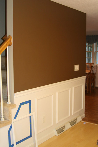
You can see in the last picture the angle I was talking about that doesn’t work with the pre-made picture frames. I used the blue tape to mark exactly what it would look like and used that as a template to cut up 2 different frames to make the angled one.
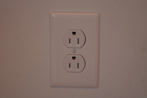
My son likes to stick things in outlets, so we are slowly replacing the outlets in every room with Tamper Resistant outlets. You can see in the picture that these are different (better) than the plastic nubs or other methods that provide resistance to tampering. There is a plastic piece inside of the hot and neutral prongs that requires an equal amount of pressure on both before it moves out of the way and allows you to
plug something in. These were also added to the NEC in 2008.After pictures:
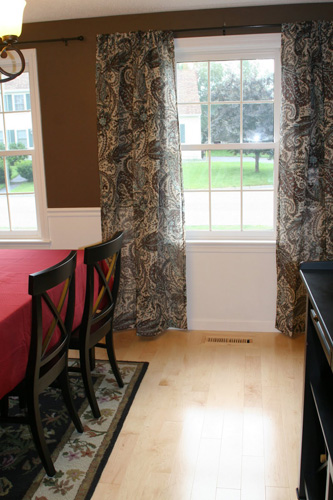
These treatments were purchased at Target. They only had 1 set, which is why the other window is treatment-less. We will have the second set added after we find a Target with them.
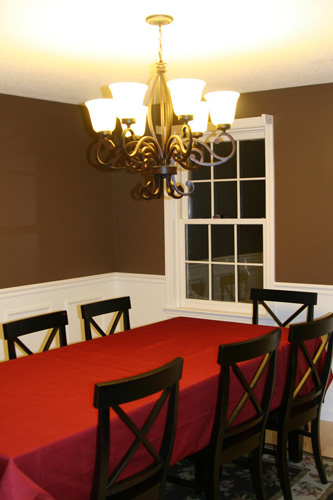
We don’t have a wide angle lens on the camera, so it is difficult to capture the dramatic difference in the room. My wife and I are very happy with the outcome and are excited to see what the house will look like after each update.
Breakdown of cost:
- $500 – Hardwood Floors
- $120 – Paint, samples, brushes, rollers (Ceiling Paint, Brown Wall Paint, White Wall Paint)
- $50 – Miscellaneous (Caulking, nails, etc…)
- $260 – Wall Frames
- $120 – Chair Rail and Floor Molding
- $90 – Light Fixture
- $50 – Flush Mount Floor Registers
- $40 – T-Mold Transitional Molding between kitchen/entry and hardwood flooring.
- $100 – Tamper Resistant Outlets, Decora Light Switches, Faceplates.
- $150 – Window Treatments (including Rods and Curtains)
Total cost for Remodel of Dining Room – $1480
Thanks Michael!
I love the hardwood floors and getting them off Craigslist is awesome! I also like the box frames- something Jocie and I are considering for our dining room. Thanks again for sharing this with all of us!
Habitat for Humanity Factoid
I’ve been reading through the Habitat World Blog recently, and I really enjoyed reading about “Warriors on the Worksite”. This short article shares how in Washington state, a local Habitat chapter partnered with the U.S. Army’s Warrior Transition Battalion. Both groups benefited as they worked on two houses for low-income families, and the soldiers connected with the local community. The read the article or view a photo slideshow, click here.
Where’s Your Before and After Story?
We hope you’ll consider submitting a Before & After story. Email your pictures and a “how to” description to beforeandafter@oneprojectcloser.com to join in.
Help Us Spread the Word
Are you a blogger? If you’d like to support us, please write an article on your blog about the contest, and consider adding one of our buttons to your sidebar. You can find the buttons and more information on our main Before and After article.



Michael, nice! I really like the inlaid vent covers. That’s something we skipped on our IPE installation because the covers themselves were just ridiculously expensive and we didn’t have time to build them ourselves.
I have some burning questions in my mind. First is: is this home a Ryan Shenandoah A? Your pictures make the house look like it has the exact same layout as ours…. Here’s a couple of links with the blueprints and interior pictures.
https://www.oneprojectcloser.com/ryan-homes-blueprint-floor-plan-for-shenandoah/
https://www.oneprojectcloser.com/hardwoods-complete-brazilian-walnut-after-pictures/
And for a REALLY weird coincidence, before we moved our dining room, we used a VERY similar brown paint… It was the first “Before and After” we ever ran on this site.
https://www.oneprojectcloser.com/before-and-after/
Very Nice~! I liked how the flush mount registers came out.
Oh yes, those flush mount registers are genius! So creative of you to fit them in this way. They look so custom!
Such a beautiful room you have created.
I am curious about those outlets. My husband installed some new outlets in my mom’s kitchen and I thought he had installed them upside down. But yours look just the same! (Maybe I should ask him about them!)
paintergal I think this is a American thing I’m not sure how it goes over there. But in Canada all our outlets have the ground on the bottom and I have never come across one like pictured in the picture above in my many travels to peoples homes or viewing new construction. I giggled when I seen the outlet as this looks upside down 🙂 though it works either way.
@Fred – It’s not the same layout as the Shenandoah but some similarities. It has a 2-car garage attached as well as on the opposite side of the house a 22×22 family room. The kitchen, dining and breakfast nook are in the same location. But the bathroom is behind the breakfast nook with the laundry room. There is a hallway going into the garage with a mud closet.
Thanks for all the kind words. We really love the dining room.
There really isn’t a right/wrong way to install outlets. I rarely see them installed in houses with ground up, but I see them in commercial buildings all the time (these are the kind of things I notice and my wife makes fun of me for). My thinking is that if something drops onto the cord, it will make contact with ground first.
Plus, it distinguishes my outlets from the original outlets so I know that I changed them over.
On the outlets: there definitely isn’t a “wrong way”; however, it’s worth noting that when you flip them over, the wider plug is on the opposite side. Adapters (AC/DC) that are mounted with the plug are designed to hang down off the plug – if you put the ground up, these plugs end of facing up and *may* be subject to falling out a little easier. The reality is that a tight plug probably won’t experience any problems at all, though.
It is very common to see them “upside-down” in commercial buildings. Also note that if they are sideways, the same logic would apply to putting the neutral side of the outlet on top. You could argue that it is more safe… but alot of people thing its ugly.
The room looks great!
Our builder installed the outlets that were controlled by a wall switch upside down so it was easy to distinguish from regular electrical outlets.
Possible dumb question but was the reason you didn’t paint the walls completely because:
1) to save paint
2) to mark the wainscotting
3) it gets covered by the wainscotting anyway so why bother
4) all of the above?
This is a project that I will be tackling soon, glad to see your information.
@Icarus: The walls are completely painted. I painted the bottom half white for the wainscoting area and the top part brown.
Hey Mike – Just FYI you can use the “reply” button under comments and it will group your reply comment with the original authors. New feature we just installed here a few months back.
craftmans miter mate is a great tool. you be surprised how many uses it has
The transformation is stunning! I have great respect for how much work it took because we are in the throes of our own DIY projects. It is also amazing how you kept the cost so low. Well done!
Great job! you can see the attention to detail, and craftsmanship. Keep it up, cant wait to see the next project.