
About a month ago I asked all you awesome readers to check out the Shaw Floors facebook page and help me out by voting for the room that Carmen (Decorating Diva) and I created. Well the votes have been tallied, and we won! I’d like to extend a huge thank you to everyone who voted- muchas gracias! Our reward was a three day trip to Chicago to see the Urban Oasis condo, and I’ve actually just arrived back home. It was awesome! And to show some appreciation, I took a bunch of pictures to share the experience with you.
This is the second year that HGTV has offered one lucky winner the chance to win the Urban Oasis. Situated on the 35th floor of the Trump International Hotel & Tower and custom designed by Vern Yip, the Urban Oasis is an amazing 1,000 sq ft residence that includes a master bedroom, master bathroom, main living space, kitchen, powder room, and breath-taking views.
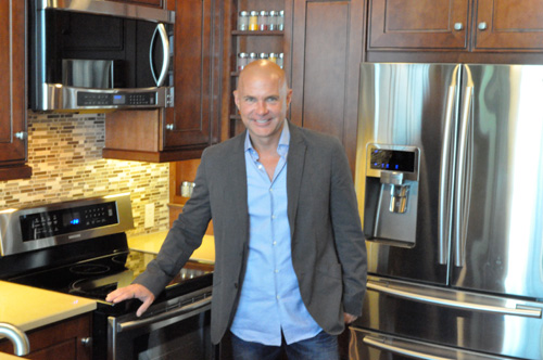
We had a private tour of the Urban Oasis with the HGTV house planner, Jack Thomasson.
The walls are painted with Sherwin-Williams paint from the HGTV Home Global Spice color collection. The green is called Edamame (SW7729) and the tan is called Cardboard (SW6124). The floors are engineered hardwoods from the Epic Hardwood Flooring collection by Shaw Floors.
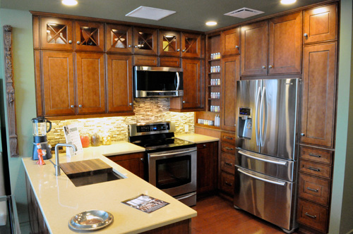
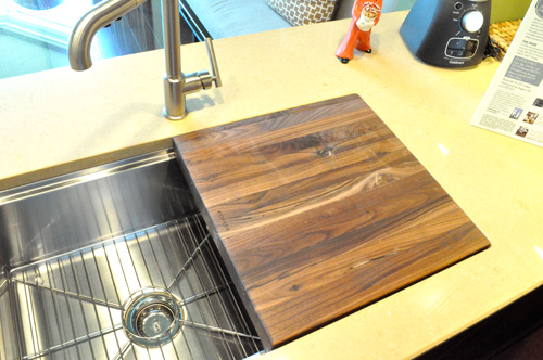
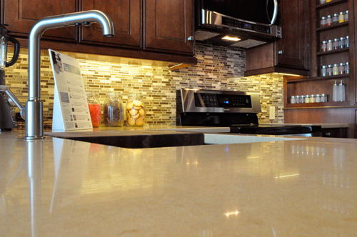
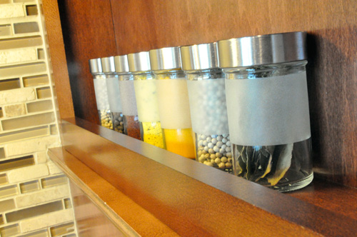
The kitchen is furnished with Cuisinart small appliances, KraftMaid solid maple cabinetry, and a Kohler 33″ stainless steel sink (with butcher’s block) and Purist faucet. I really liked the glass cabinet fronts and open shelf spice rack that provides so much visual interest rather than a wall of storage.
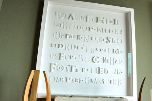
The main living area had a beautiful piece of art called Magnificent Marquee by Todd Mack (Jocie’s favorite that she hopes to DIY) and an awesome “Monorail Lighting Fixture.”

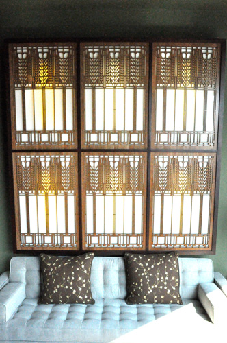
This is a custom mahogany framed sconce created with six “Tree of Life” panels designed by Frank Lloyd Wright.
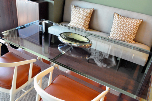
Here’s a picture of the dining table with a Chrome Schoom Bowl. You can sort of see the reflection of a very cool salvaged terra-cotta eagle and shield from the now demolished Charles Brewer building.
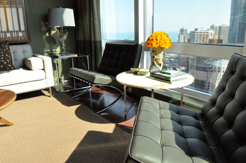
I really liked the small sitting area and how they used the flowers to introduce some bright color.

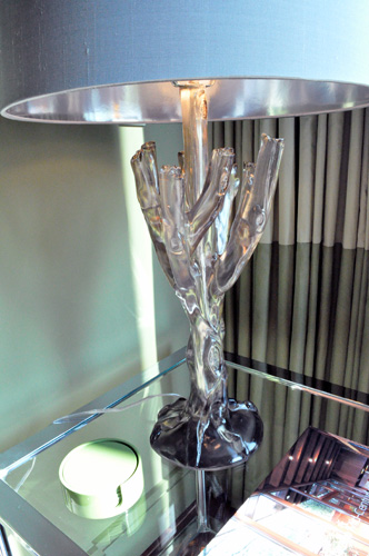
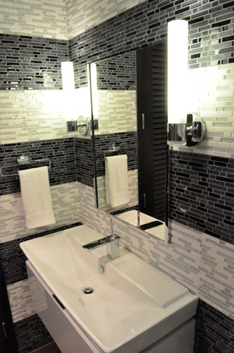
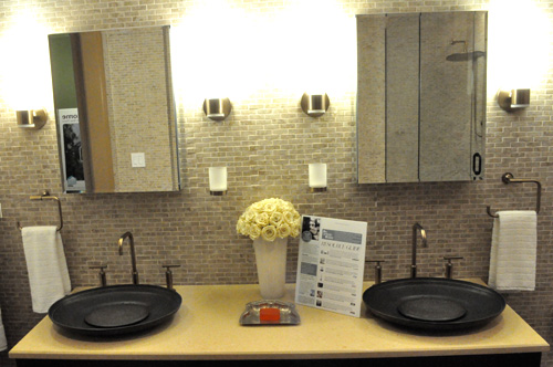
This is the guest bathroom, and tucked behind some louvered doors you’d find a stacked washer- dryer.
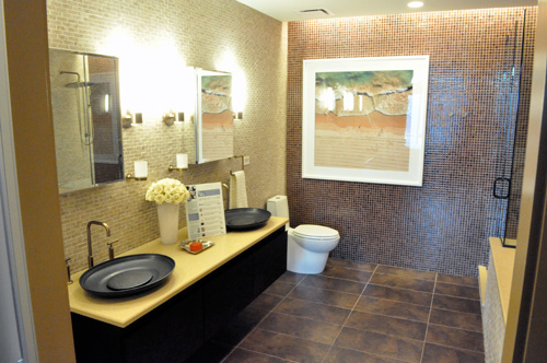
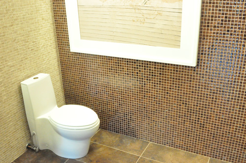
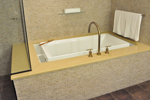
Trump had received a lot of feedback that people wanted a larger master bathroom, and he responded with a disproportionally large space. Check out the Kohler overflowing bath, Saile toilet with dual flush technology, and black walnut wall-mount cabinet.
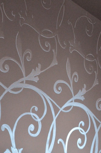
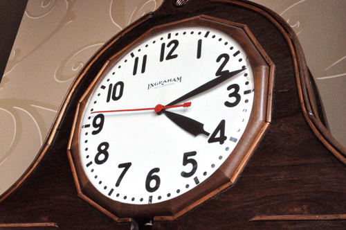
The bedroom featured beautiful free-hand artisan wall painting by Michael Boudreault. You’ll also see pictures of the canopy bed, a 1940’s sewing desk, and clock.
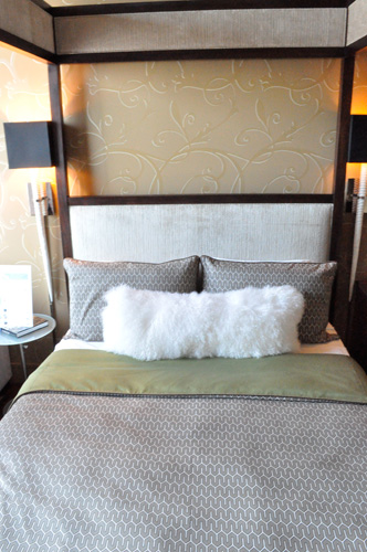
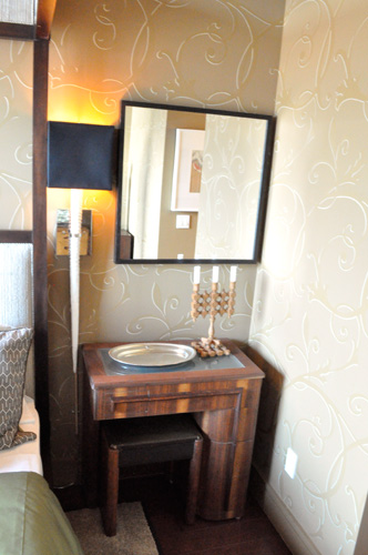
Vern did a wonderful job decorating the space, providing a beautiful integration of modern and vintage while also incorporating the city of Chicago. Vern is known for bringing the outdoors in, and that is really seen in this condo through the use of color but also using decorative pieces that reflect city surrounding. With floor to ceiling windows, the city is naturally a part of the the design but there are also some amazing small touches that really tie the Chicago theme together, like the eagle that came off a Chicago building or the use of tile imitating the brick work found in Chicago architecture. It is evident that every aspect of the design was well thought out, creating a really unique and beautiful space.


Oh, wow! Thanks for sharing this with us. I love how the small glass rectangular tiles in the kitchen mimic the ones on the bathroom sink wall.
The living room photo with the bright yellow roses looks like it is sepia toned. Cool photo!
ooh pretty pictures! I <3 Vern
Those are some superb rooms there. Really like the tiling on the bathrooms.
Glad you guys won. Honestly, your room was the best. We didn’t just vote for you because we like OPC.
On the topic of Urban Oasis… While it looks pretty good, it isn’t my style. I’m an arts and crafts style person. Mostly because I can duplicate many of the features in my garage. The bedroom walls were painted freehand? Wow. Amazing skill.
Wow, what a beautiful space. I absolutely love the rich wood tones of the cabinets and here and there around the home especially in contrast to the hard shiny tiles. The space as a whole is a visual delight!
There are such unique features and design elements unlike anything I’ve seen. I really like the flower bouquets, they bring a nice feminine touch.
While some of it is not my taste, overall it really is a beautiful space. It looks comfortable and functional, and a lot more space than I would have thought. Especially love the kitchen cabinets and living area.
If only money grew on the trees in MY backyard!
I am not sure which i love more, the kitchen cabinet color or the view!
What a home:)